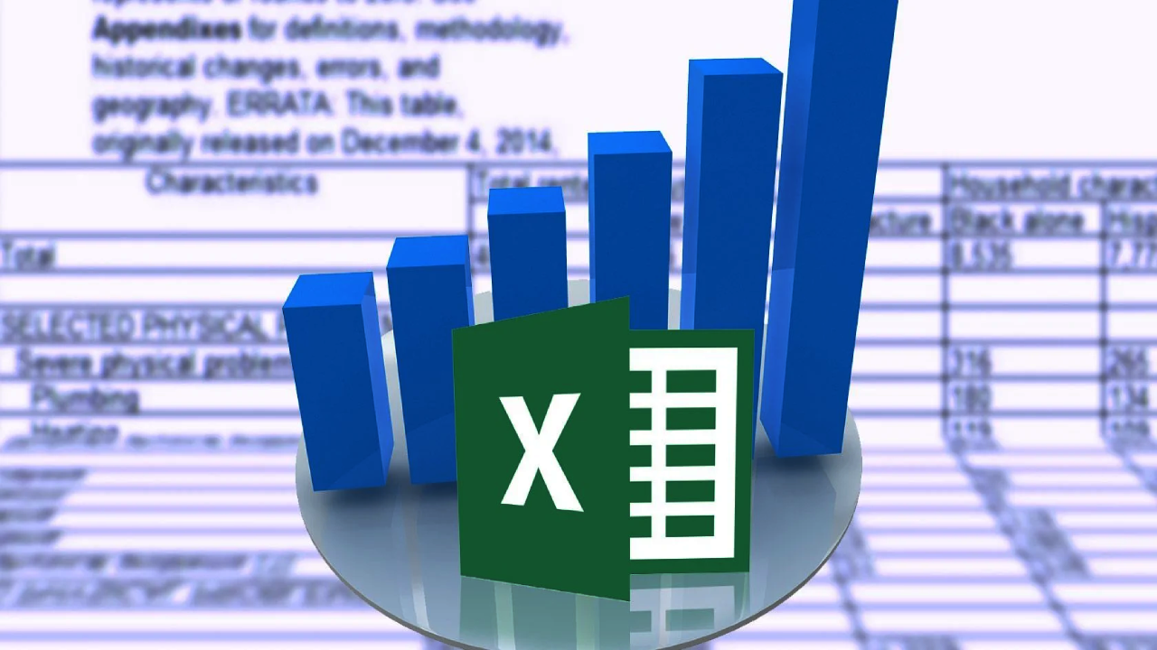
It has been proven that graphics are easy to grasp compared to blocks of text. Charts and graphs offer an incredible way of presenting and visualizing numbers. Microsoft Excel has excellent features that make it easier to create charts and graphs that you can use in your data presentation.
There are tons of data that are generated on a daily basis across the industries. This data needs to be organized and presented in an orderly manner to generate valuable insights used in decision-making. You need to display your data in a manner that compels your audience to navigate through and use it appropriately.
There are indeed many tools used in creating graphs and charts. Excel remains one of the most excellent tools that you can use to visualize your data. Microsoft Excel gives you the freedom to visualize your data in different formats and styles depending on your needs. Many people experience challenges when it comes to presenting data in various formats that persuade readers.
This article presents Excel chart examples and how you can use them in various circumstances when they are used. It is evident that many people experience challenges when it comes to getting quality charts and graphs to use in dot plot maker. This blog post has all your questions answered!
1. Excel Line Charts
A line chart showcases different variables as they change depending on the time frame. To use a line chart, you need to begin by collecting data from various sources. The data is outlined in an organized manner while the data points change over the given limit, although not all the time. You only need to have X and Y values to outline your data.
You can use a line chart to evaluate things such as population over a given time frame. The chart reads in a manner that when one variable on the X-axis changes, it impacts the other element on the Y-axis. But how do you create a line chart in Excel? Ensure that you have all the data values right depending on what you want to analyze.
Outline the data in the Excel sheet and click insert on the menu. The insert button gives you more options where you choose on the line graph. Right-click on the chart and select the data source.
2. Excel Bubble Charts
Bubble charts play a crucial role in data presentation in Excel. Besides, this is one of the most exciting types of charts to create using Excel. All you need to have is three data dimensions, and you are good to go. In simple terms, a bubble chart is a typical XY plotted data point with a couple of values. In this scenario, the point is labelled as a bubble.
The values you outline are meant to determine the size of the bubble. For instance, you can create a bubble chart showcasing the number of teens who go to the movies. When plotting the chart, you can use the number of females in the data set as the size of the bubble. Besides, you can outline the movie names to identify the kind of movies that attracted a good number of teens.
You can use a bubble chart to present any kind of data as much as you have all the data elements right. Also, it is a good choice, especially if you want to evaluate your data from a different point of view. The size of the bubbles gives you a clear picture of the reality of things depending on the nature of the data.

3. Excel Scatter Charts
A scatter plot is an outstanding choice within the scientific community that utilizes different data aspects. A scatter plot refers to plot data points that outline different variables within a given organization. It is a good choice when identifying similarly-measured data points and a far-reaching outlier.
Also, you can use it to identify correlations or different forms of patterns within data sets that are not obvious. Scatter charts play a critical role when you want to generate detailed insights from data and identify possible similarities and differences within data sets. You create a scatter plot to showcase the disease’s recovery success rate against the time spent in a hospital.
Once you have aligned the success rate against the time, you are better positioned to showcase stats on every disease outlined and the recovery rate. You can easily count the number of patients who got healed within a certain period and the kind of disease the patient was suffering from. An Excel scatter chart gives data analyzers an open ground to observe and analyze, comparing it with the time frame allocated for every element.
4. Excel Pie Charts
Just like the name suggests, a pie chart is shaped like a pie. A pie chart is mainly used to showcase the dominance of every data element at your disposal. When using a pie chart, note that all the data categories are equivalent to 100%. This type of Excel chart comes with appealing colors to identify different data values.
When you intend to categorize different types of data, a pie chart gives you more room to evaluate, analyze, and categorize the data into groups. When you have a uniform type of data that has been broken done into varying portions, you can use a pie chart to showcase how the data values vary from one another.
Besides, suppose you have multiple data sets that you intend to present to your audience. In that case, a pie chart gives you a comprehensive to analyze every data element to help your customers get a better view of the data. Once you have presented your data in an orderly manner, you need to use different colors to help readers understand what every part represents.
Note that you don’t need to possess any technical skills to present your data using a pie chart. Besides, anybody can read the data and understand it without translating unnecessary jargon.
In Conclusion
Excel is one of the best data visualization tools that you can implement in your data visualization activities. The tool comes with a bunch of charts and graphs that you can easily customize depending on the nature of your data and the desired final output. You can opt to acquire any of the above Excel charts and graphs in your data presentation.